BRIEF
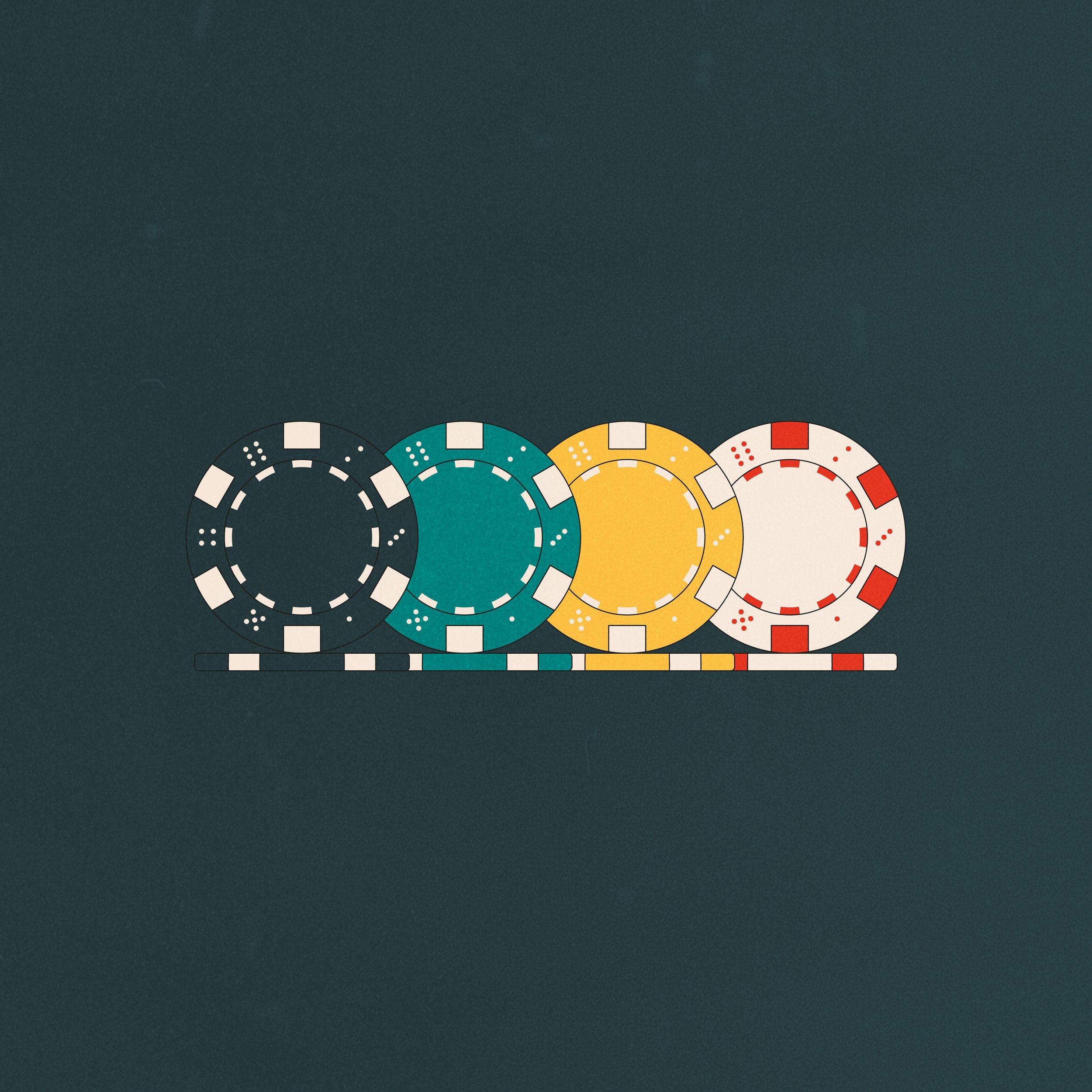
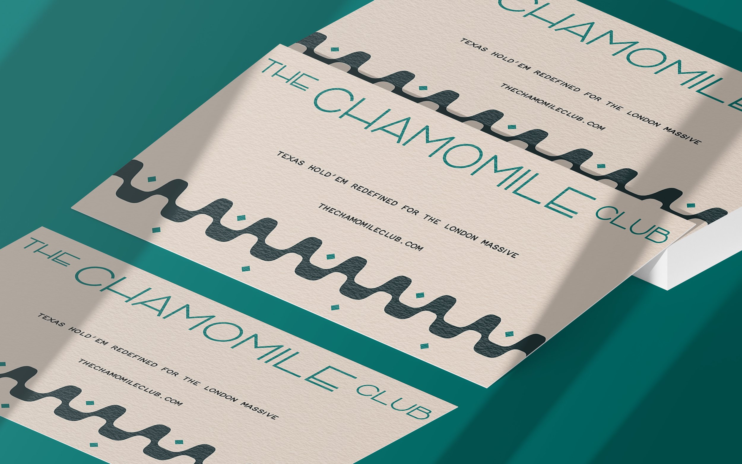
Established in 2021 by four friends, The Chamomile Club is revolutionising the world of poker with an added twist of hot tea (quite literally). The invite-only club aims to offer a more social and modern approach to the game, welcoming both beginners and seasoned champs alike. With casino chips, gourmet dinners and all-around good vibes, the founders are committed to providing the ultimate poker experience for the London massive. The Chamomile Club reached out and asked us to create a brand identity that gives a friendly feel without taking away from your poker face.
The Chamomile Club
BRAND IDENTITY
COLLATERAL
PACKAGING
MERCH
WEB DESIGN
RESULTS
During our research, we were heavily inspired by art deco influences and the timelessness of their symmetrical geometric patterns. The teacup outline and casino chip shape that we chose for this icon are both clear and recognisable visual cues that immediately describe the club. In order to adapt to a contemporary poker setting, we chose the update the classic green playing top with a fresh teal blue. This colour not only adds a contemporary spin to the traditional poker palette, but also enhances the overall vibrancy and energy of the design.


